Route—Route Mobile App
From zero to three million monthly actives.
I was the only designer on Route’s consumer app from the start through launch and its first year. More designers joined as it grew. When I left Route in 2024 the app served over 50 million people at 3M monthly actives, held 4.8 stars across 516,000 reviews, and had cut merchant “where is my order?” support tickets by 75%.
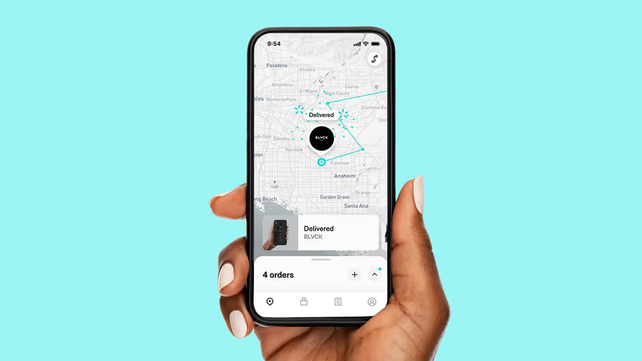
- 3M
- Monthly active users
- 4.8★
- From 516,000 ratings
- 75%
- Fewer support tickets
- 10.5
- Sessions per user, per month
- 50M
- People served
- $1.4B
- Company valuation over the same period
The Problem—A product with no reason to exist
Route’s business ran through merchant checkouts. An app wasn’t required for any of it, and carriers already had their own apps for tracking. It had to earn a reason to exist.
Why would anyone install a tracking app when the carrier already sends them an email?
After Launch
When we launched our app I had designed it as a lookup tool: get in, check the status, get out, and the faster that happened the better it was working. What I found out next changed the approach.
- Installs from checkout ran far above anything we had projected. People wanted it before we understood why.
- Then they kept coming back: 10.5 sessions per user per month, roughly 10x traditional tracking.
- The tracking data itself did not explain it. A delivery date might change five times or not at all, and it was the not knowing that kept people checking.
- Delivery notifications were huge. They were checking on a box left out where someone could take it, or counting down to something they had been waiting for.
Waiting for a package is a small, pleasant anxiety, and we had accidentally built the place people go to feel it.
That flipped what “good” meant. A lookup tool minimizes visits. A ritual rewards them. I had been optimizing for the wrong one.
The Solution—Make it worth opening again and again
01—Show the whole picture, not one shipment at a time
If someone opens this ten times a month it has to survive repeat viewing. The first thing I drew was the map, and it held: every package on one screen with a simple progress state under it. It became US Patent 11183037, and it set the direction the company took. Someone with four orders spread across more than a thousand possible carriers does not think in shipments. They think about what is coming, which became the company line: “All your orders in one place.”
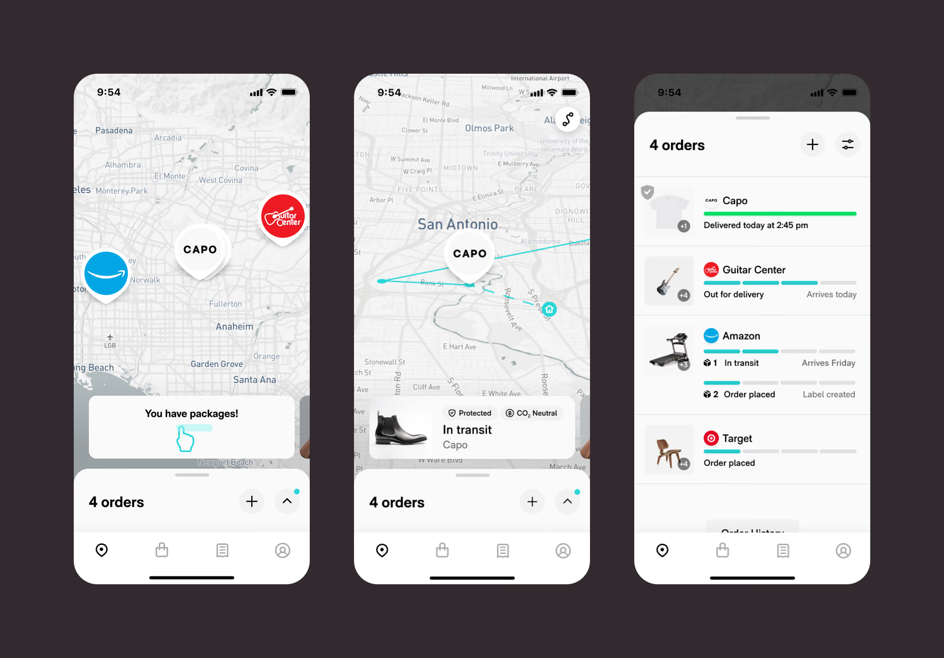
Every package on one map, one shipment in transit, and the list they all roll up into. 02—Answer it in the app, or they go ask the merchant
Real carrier feeds are late, inconsistent and sometimes wrong. A shopper who could not get an answer in the app went back to the merchant to ask, and every one of those questions cost us a little of that merchant’s trust. So most of the work went into states hardly anyone sees.
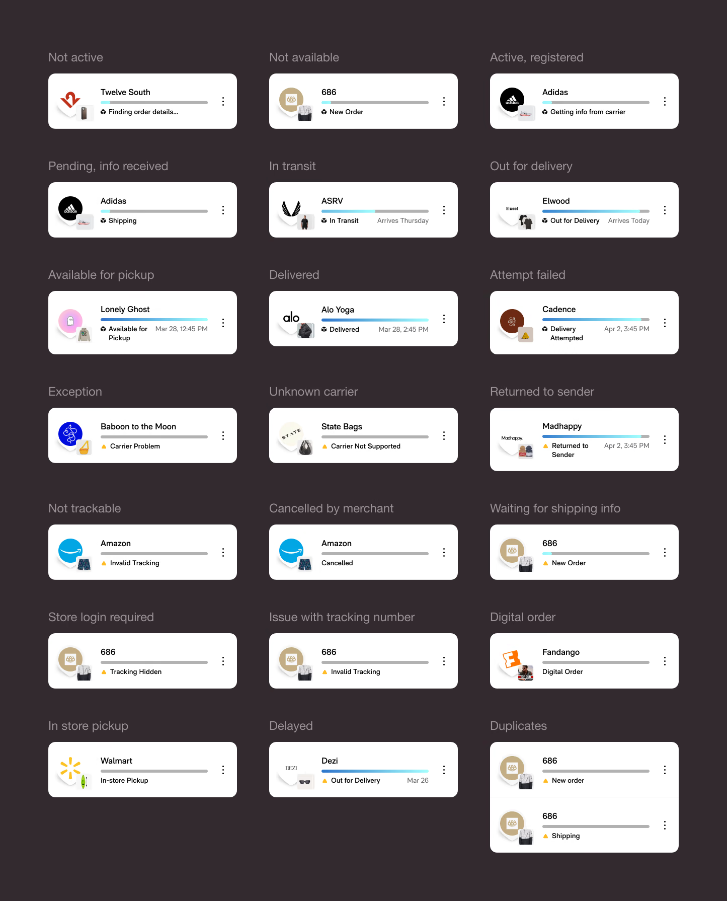
Twenty-one shipping states, each designed. Most people only ever see three of them.
The Growth Loop—Five surfaces, one experience
Almost nobody went looking for the app. They bought protection at checkout, and then tracking came to them: an email under the merchant’s brand, SMS, and a web tracker for people who did not want to install anything. Every one of them pointed at the app.
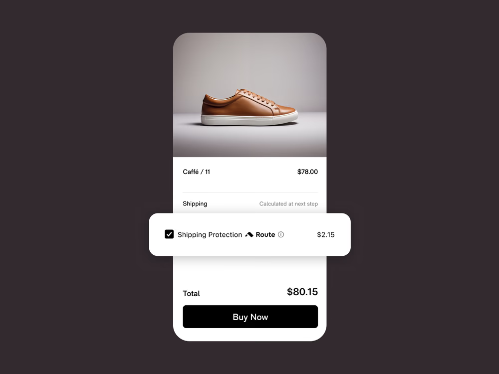
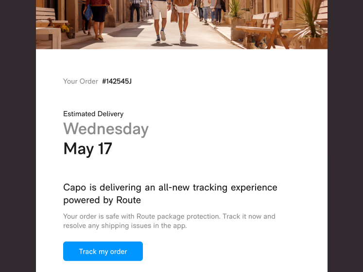
They all read from one central tracking service, so the data agreed. The language and the design did not come free. We wrote the shared status vocabulary the tracking surfaces ran on, and I kept the branding and design language consistent across all of them, most carrying a merchant’s name alongside ours. A delivery date or an order status that read differently in one place broke the handoff to the next.
Outcome—What happened
Merchants who watched their support load fall kept the widget in place, which kept the loop turning. That is what produced 3M monthly actives, 4.8 stars across half a million ratings, and a 75% drop in support tickets.
That last number is the one I care about most. A support ticket means a shipment went wrong and the app did not answer the question. Fewer of them means all that state design was doing its job, and it turned merchants into advocates.
Learnings—Key takeaways
Find the real motivation, not the stated one
Package anxiety drove more growth than anything we built on top of it. You can ship feature after feature and never touch the one thing that actually brings people back.
A/B tests are the gold standard of product research
Research said shoppers would gladly pay for carbon-neutral delivery. We built it, shipped it, and it did not move the needle. What people will actually pay for shows up in a test, not a survey.
Consistent data does not make a consistent experience
Every surface pulled from the same tracking service, so the dates and statuses always agreed. Wording them the same way was separate work, and somebody had to own it across five surfaces, most of them carrying another company’s brand.
A 4.8 across half a million ratings isn’t a rating you chase
At that volume you get it by not annoying several million people for two years. Most of that is unglamorous state design, not the hero screens.
Next