Route—Route Design System
The CEO wanted to hire an agency. We asked for a shot first.
Route was scaling fast and moving upmarket. The product was consistent already, but that consistency lived in people’s heads rather than anywhere you could point to, which does not survive a growing team. Our CEO suggested hiring an agency for the refresh. We asked him to give the team a chance first. Building on the component library I had been growing in Figma since the early days, we shipped the brand, an updated design system and a rollout plan in under a month.
- < 1 month
- Pitch to company-wide rollout
- Fails AA → Passes AAA
- Primary button contrast
- Light + dark
- Shipped as first-class, not an afterthought
The Problem—A system the product team used, and nobody else
This was not a rescue. I had been building components and styles in Figma as we built the company, so the product team had a working library and good instincts about type, spacing and interaction. What it did not have was a brand wrapped around it, anything codified for people outside product, or a reason for the rest of the company to reach for it.
The trigger was commercial rather than remedial. Route was growing fast and moving upmarket, and the brand needed to carry that. Our CEO suggested hiring an agency for it.
An agency would have delivered a beautiful brand book.
But not a system anyone used on Monday.
The Pitch—Why the team should own it
The argument I made was not that we would do it cheaper. It was that a brand refresh handed over as a PDF becomes shelfware, because the people who have to live with the decisions were not in the room when they were made.
- A system built in-house ships as components engineers can import, not as specifications they have to interpret.
- Whoever builds it stays to advocate for it, which is most of the actual work.
- We already knew where the debt was. An agency would have spent the first two weeks finding out.
We asked for one month. That constraint was self-imposed and useful: it kept the scope to what a team could genuinely absorb.
View the full pitch deck here.
The Solution—One source of truth, built to be used
01—Redraw the logo we inherited
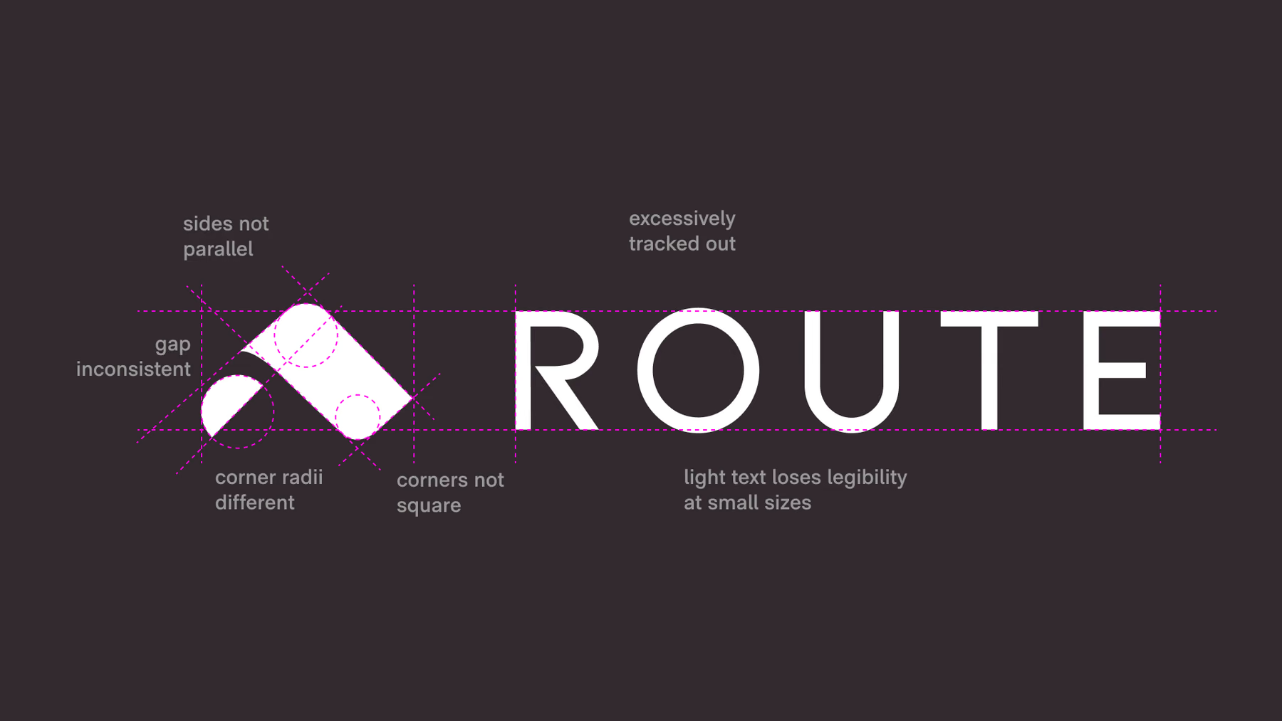
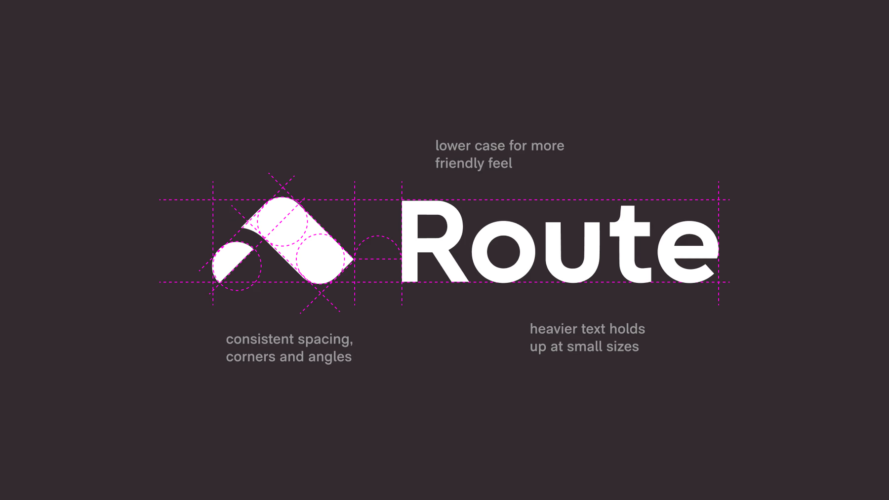
The mark we inherited had sides that were not parallel, inconsistent gaps, corners that were not square and radii that did not match. I rebuilt it on a construction grid. The wordmark was excessively tracked out and lost legibility at small sizes, so it came back tighter, lowercase and heavier.
Before
I cleaned up the mark and wordmark for a company moving upmarket. 02—Give the brand a point of view
The existing Sky Blue failed AA on the primary button at a contrast ratio of 2.00. Correcting it to 4.72 passed, and killed the thing that made the color feel like Route. So we drew a new one. Sorrento Blue, named for the Italian coastal city, reads at 16.77 against its label and still looks like a brand rather than a compliance fix. It came with voice principles to match: warm, authentic, bold.
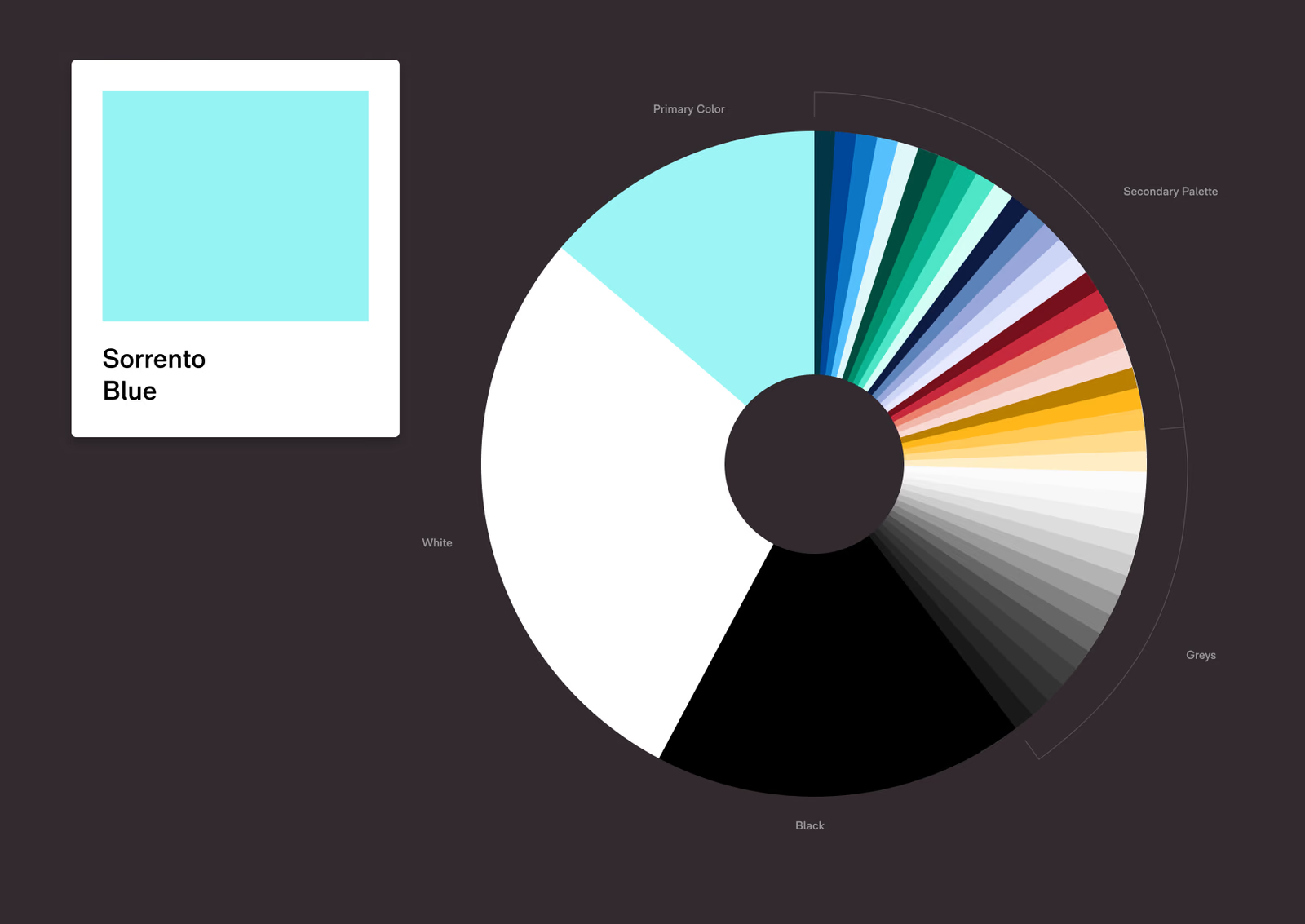
White, black and Sorrento Blue carry most of the product. Everything else is there in small doses. 03—Pick one typeface and write down how to use it
We went through type foundries to find one face that could carry everything. RM Neue won on dynamic sizing and weighting, and on the glyph coverage our accessibility and localization needs required. Then it got documented: the full family, the character set, nine type styles for the app, and a philosophy for when to reach for what. Choosing a face is the easy half.
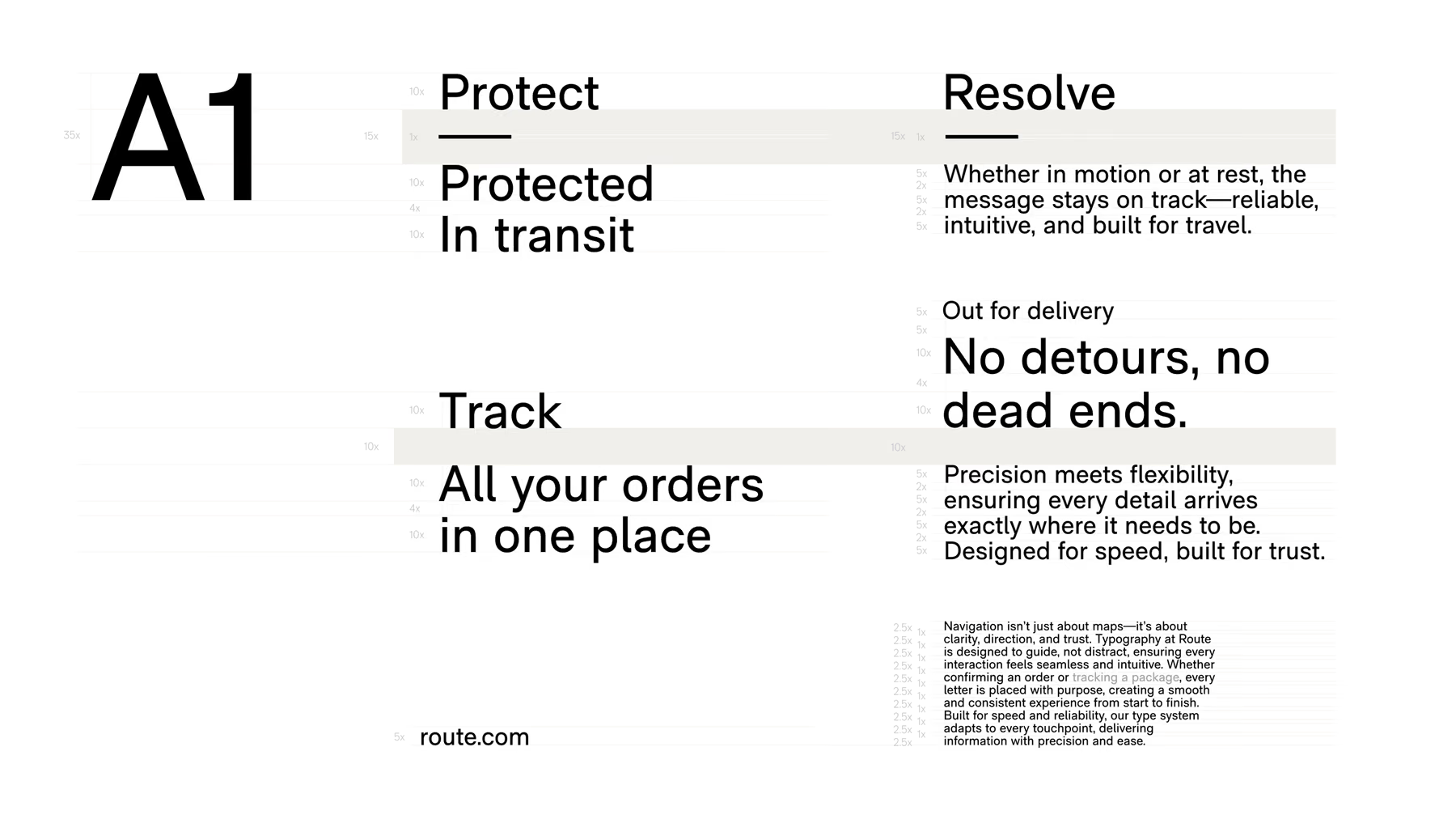
RM Neue, the variable typeface we found that met every need we had. 04—Draw the icons and marks for both modes from the start
We drew the entire icon set rather than licensing one. Every icon sits on the same grid at the same stroke weight, so it holds its shape shrunk into a navigation row and blown up as a graphic, and it reads on white, on black and on Sorrento Blue. Designing for both modes from the start is the point: retrofitting dark mode is how systems acquire a second, worse set of tokens.
The Route AI animation, in Sorrento Blue. 
A badge treatment that keeps contrast, legibility and brand recognition at almost any size or placement. The entire icon set drawn in-house. 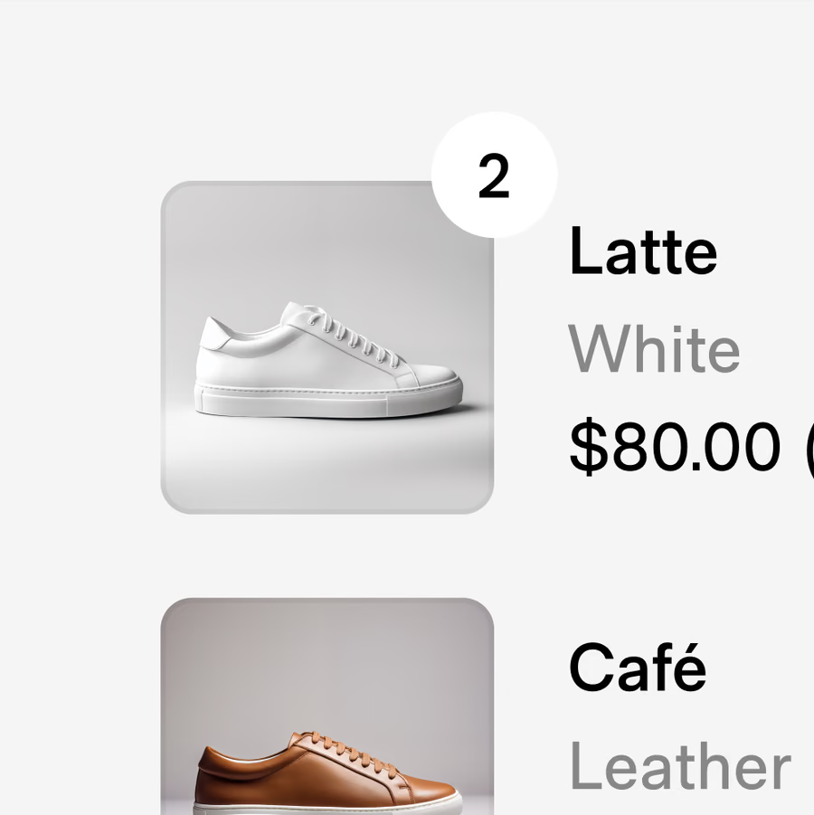
Details this small repeat across every surface. That is where a system pays off. 05—Make the map work in both modes
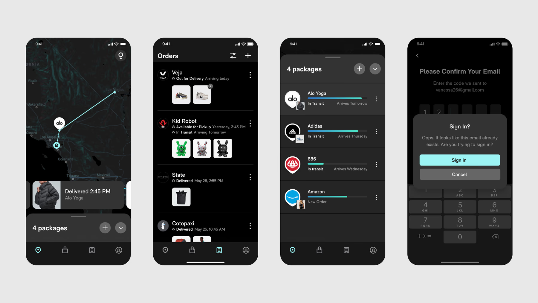
Tracking is the product, and the map is most of the screen. I built two custom styles in Mapbox out of the brand palette rather than tinting the defaults. The light map trades grey for something warmer, the dark one runs on Sorrento Blue, and both stay legible at the sizes people actually hold them at.
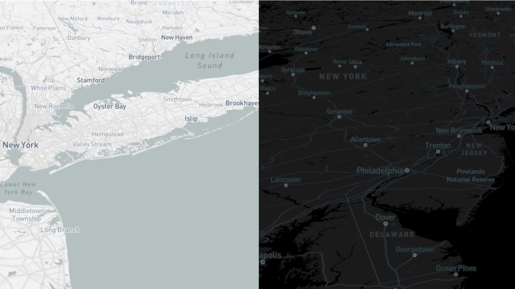
Two custom maps, not one map with the colors inverted. 06—Take mobile seriously as the primary case
Typography through to touch targets designed for the phone first, because that is where the overwhelming majority of post-purchase tracking happens.
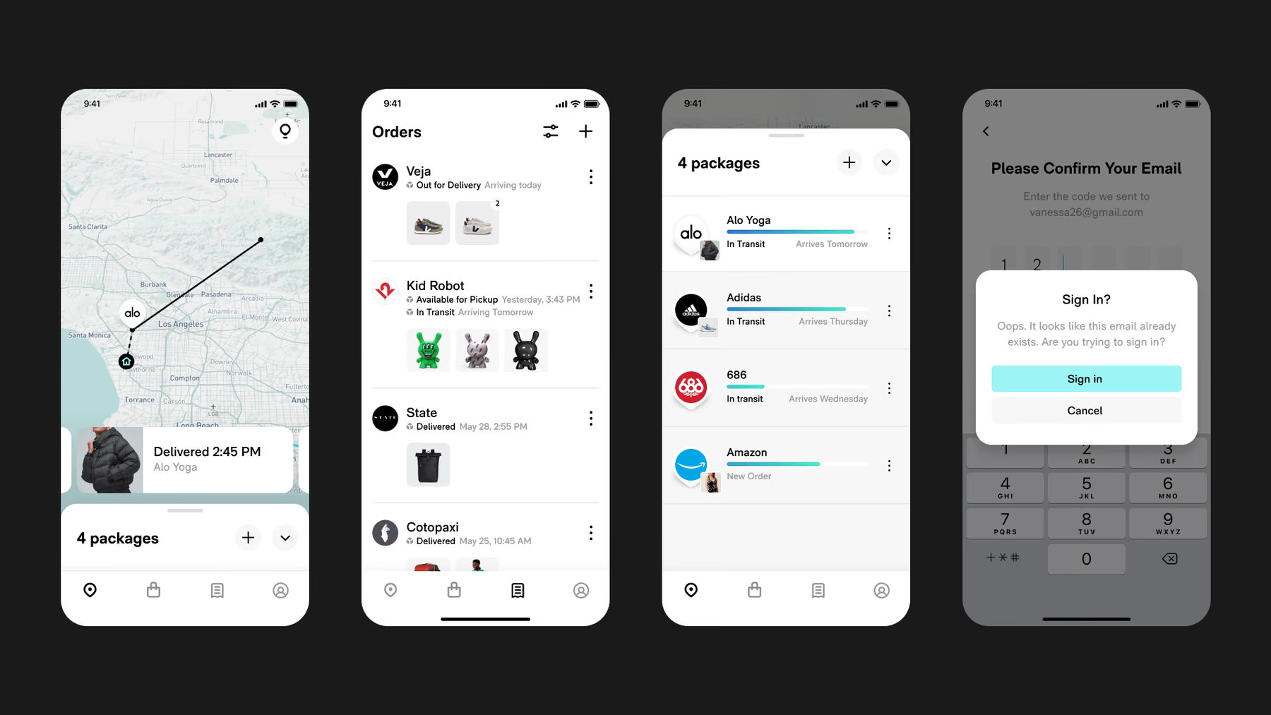
Light
The same four screens, both modes, neither retrofitted.
Outcome—Adopted, and then maintained
The CEO backed it and it rolled out company-wide. The refresh stayed in the building, which was the whole argument.
Rollout is not adoption though. Getting the system genuinely used took another six months of advocacy after launch, and that turned out to be the real work.
It is still in use today. It carried the brand through a vital high-growth period, and continues to build shopper trust with consistent branding.
Learnings—Key takeaways
A design system is a living product, not a deliverable
An agency deliverable is finished the day it lands, which means it could never have foreseen all our needs. Because we built it and stayed with it, ours adapted to what the product needed instead.
Design thrives in constraints
Correcting our existing blue until it passed AA left us with a color that worked and meant nothing. Treating the contrast requirement as part of the brief instead is what produced Sorrento Blue: 16.77 against its label, and still unmistakably Route.
Simplicity is what made it adoptable
We kept it to the decisions people make every day and stopped there. A more exhaustive catalogue would not have been more adoptable, just more to read before anyone could start.
Next